Brand Design for Startup Company Mapi Life
Supercharge your time, emotions & opportunities. Become the person you aspire to be. Live your best life.
Mapi Life, a fresh approach to self-improvement and well-being, was founded in 2021 by Sarah Rowley. The online platform took users on a journey of self-discovery offering them a set of 12 guiding principles each with detailed strategies to help them heal, grow, and thrive.
We cannot solve our problems with the same thinking we used when we created them.
Albert Einstein
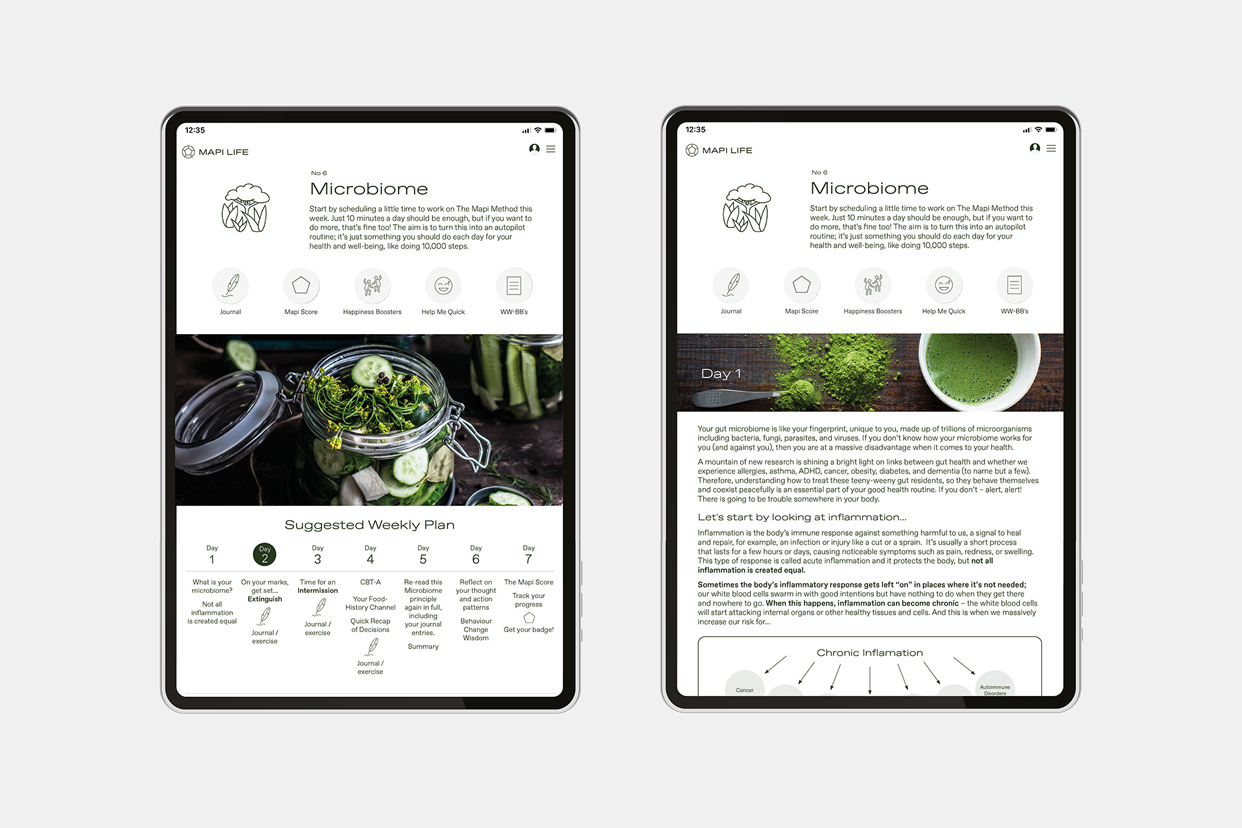
This project entailed brand design for the Mapi Life visual identity and UI design for the Mapi Life app and landing page. UI design entails deciding what the application is going to look like. Choosing colour palettes, button shapes, line weights and the fonts used for text. UI designers create the look and feel of an application’s user interface.
For the Mapi Life brand identity, concepts were developed and refined into final art for the logo, logotype, fonts, colour palette, hero imagery and style guide. The brand kit was then applied to EDM templates, email signature, icon illustrations and the landing page. The look and feel needed to reflect the science-based research that Mapi Life offered.
App design is an ongoing process that focuses on delivering value to the customer via user experience (UX) and user interface (UI) design. While the role of the UI designer is to focus on the look and feel, the UX designer’s focus is on how it works.
The logo is based on the dodecahedron — a geometric shape made up of twelve regular pentagons. Dodecahedrons are known as Platonic solids and are prominent in the philosophy of Plato, their namesake. The ancient Greeks studied the Platonic solids extensively.
The font was chosen for its contemporary 'lux meets science' look and feel. A range of concepts were developed for the final style guide and then refined into one chosen design.
Users reported that they loved the content and found that the app did make a significant impact on their lives.